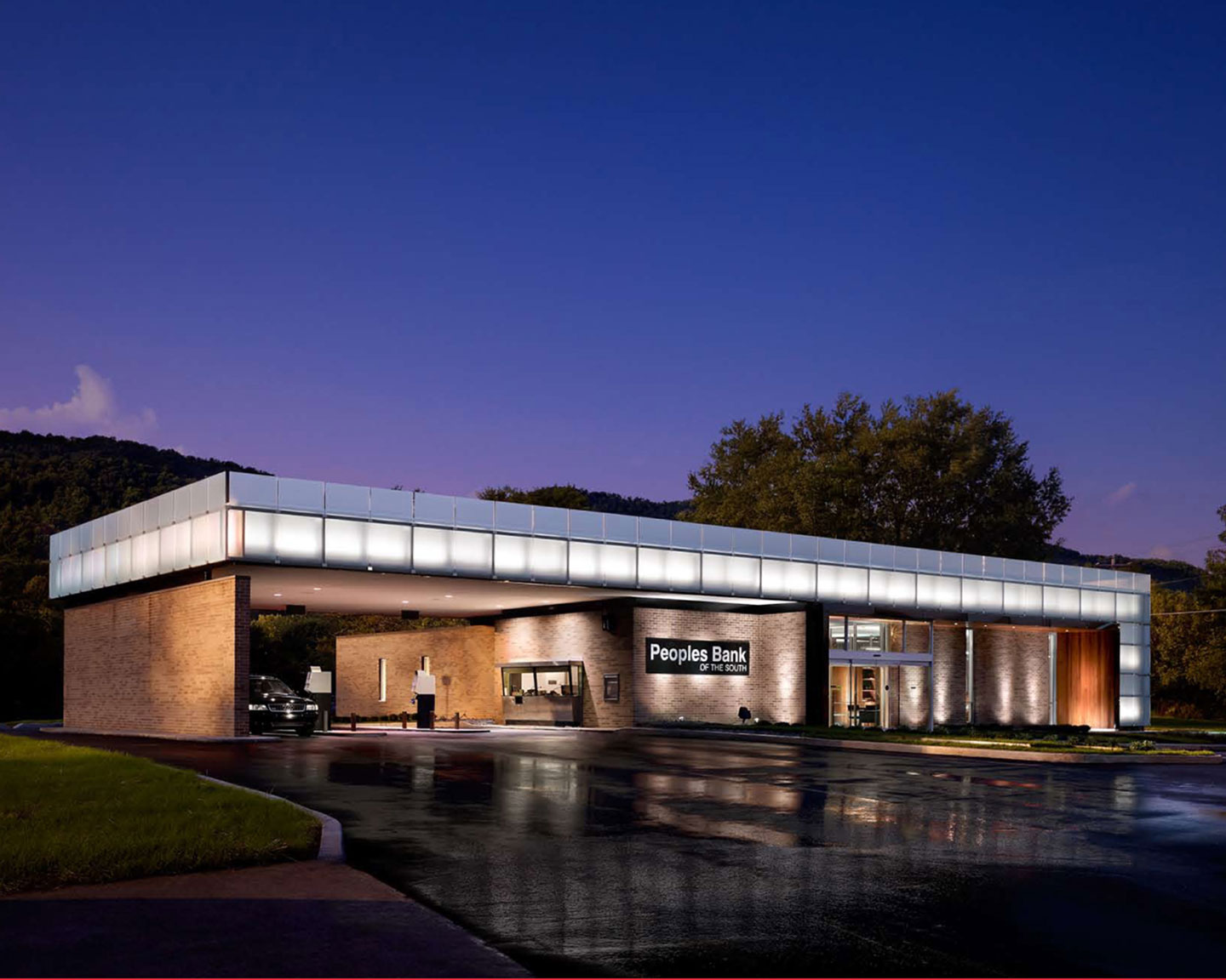
Peoples Bank of the South
When approached by the President of a 90+ year old regional bank to provide recommendations for the renovation and modernization of an existing branch office originally built in 1975, the design team first assessed the many challenges facing the industry and the many updates necessary in order for this bank to remain relevant and succeed against the constant threat of national conglomerates. It was quickly realized that this type of transformation would require a holistic approach, one in which not only finishes and furnishings but also interior layout changes and site and building systems improvements would need to be addressed after years of deferred maintenance. As an additional challenge the bank President stipulated that this branch office remain open throughout the construction process.
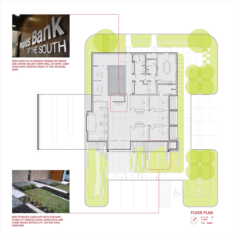
The original layout celebrated the location of the vault, the traditional but impersonal heart and soul of the banking industry. The new layout shifts the focus away from this abstract concept and instead focuses on the experience of the customer and the interpersonal relationships formed between the bank and its community. It is these experiences and relationships formed which will be important to the continued success of a regional bank such as this.
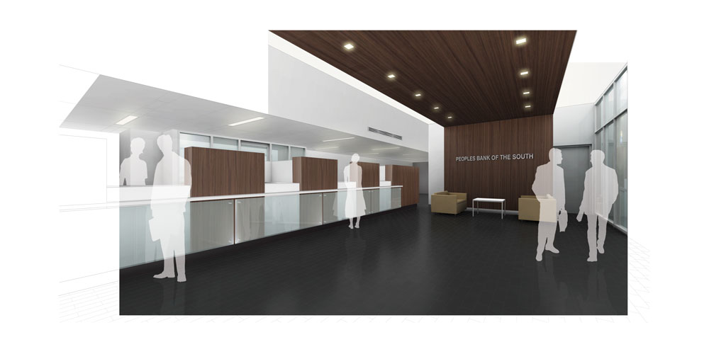
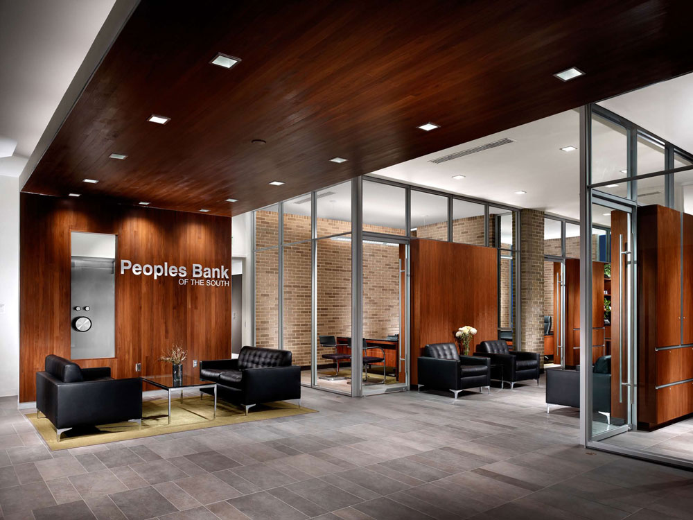
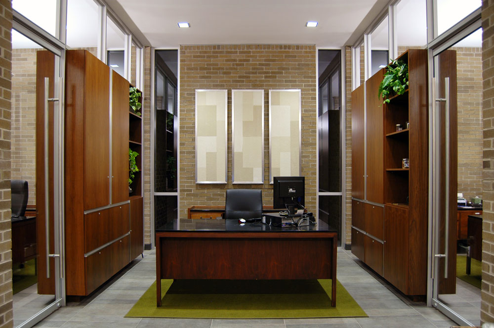
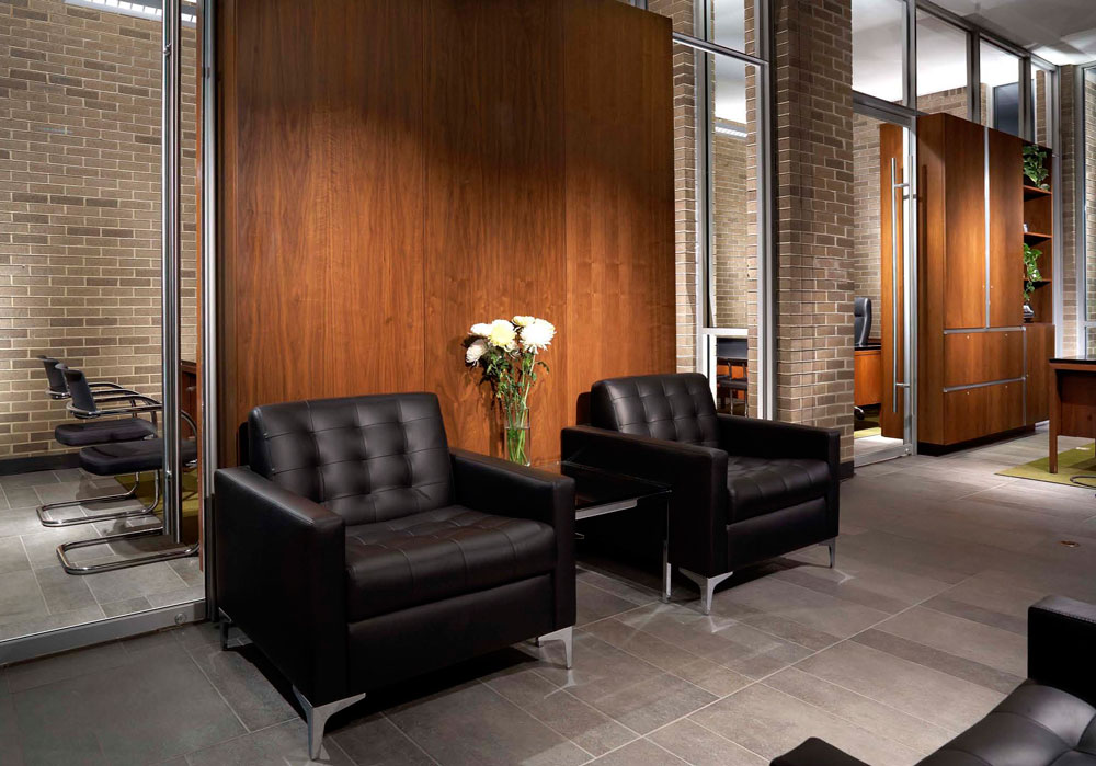
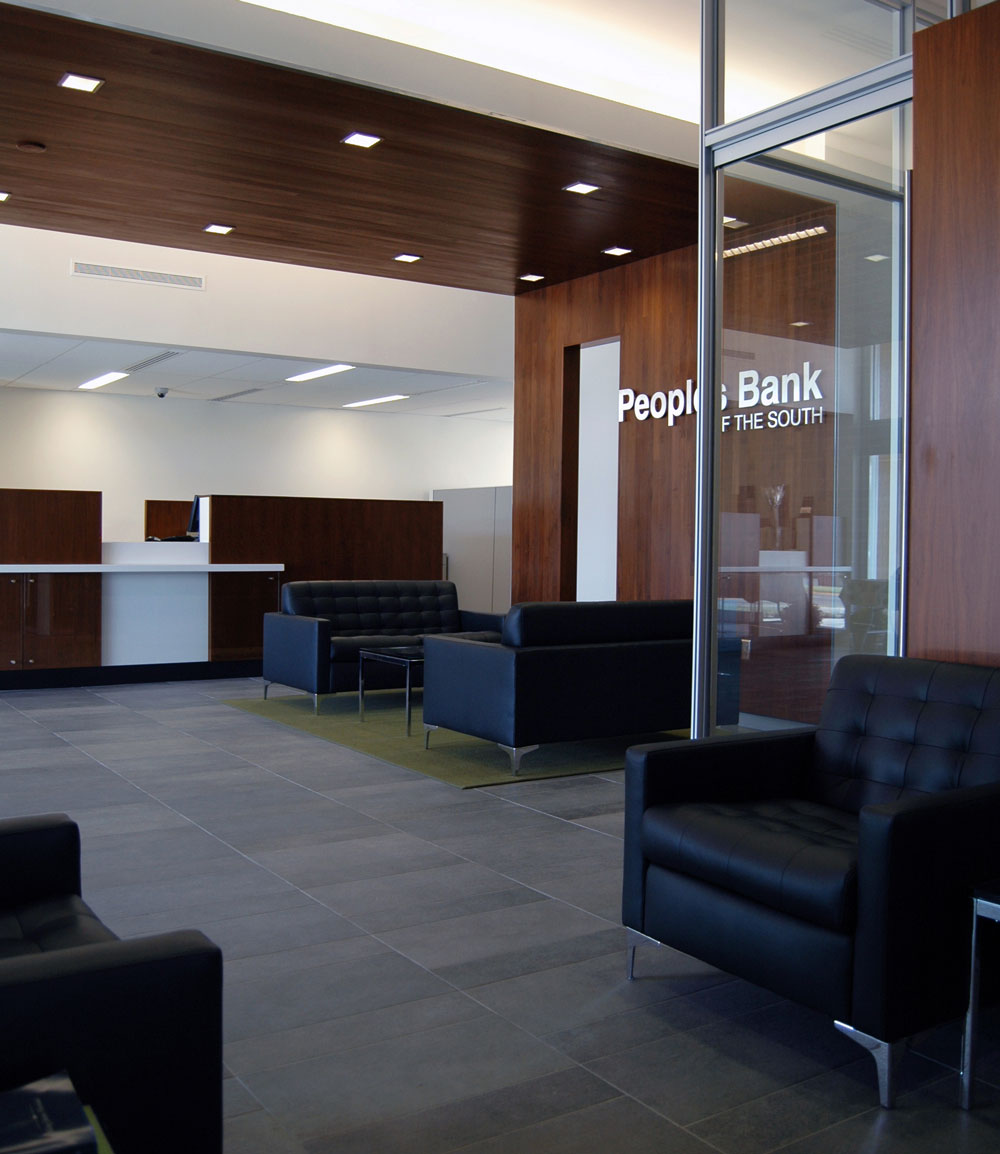
On the interior, decades of growth and technological advancements had left the major office spaces adjacent to the public entry filled with clutter. The creation of usable zones dedicated to easily accessed storage became a priority, the creation of a calm, clutter-free space within which to work and conduct business the primary goal. Integrated walnut storage boxes were integrated within a new slim 3/8″ profile storefront system defining interior office spaces. Tongue-and-groove walnut was also utilized as a wall and ceiling material at the entry lobby, clearly defining this public zone and culminating in a signage wall adjacent to a seating area for waiting customers. These rich wood materials coupled with a new deep grey porcelain floor tile throughout complement the original interior brick surfaces retained within the office spaces. Additionally, a combination of recessed lighting and suspended direct/indirect fixtures work with slot air diffusers to de-clutter the ceiling plane and add a further level of refinement to the space.
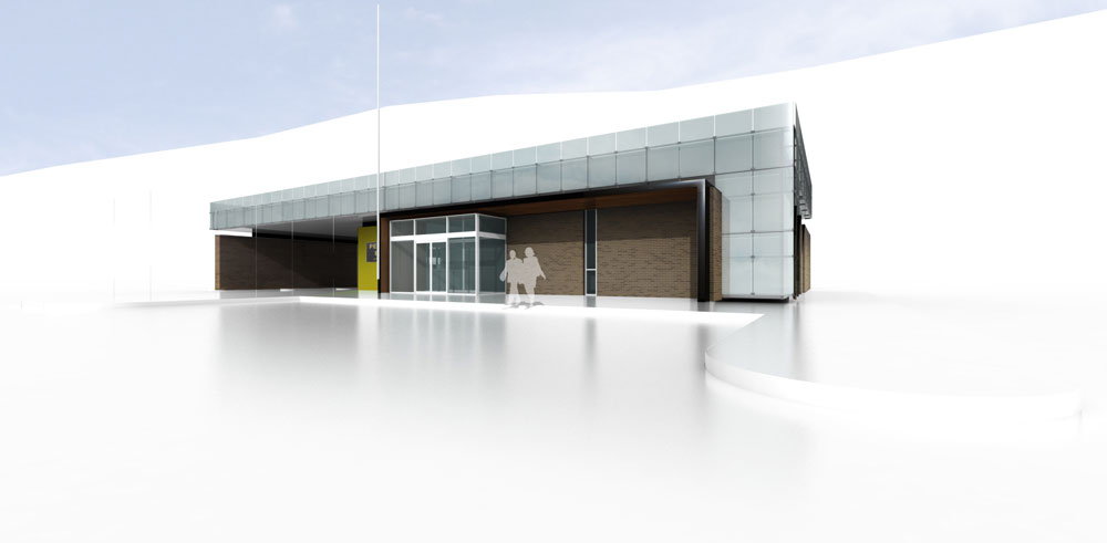
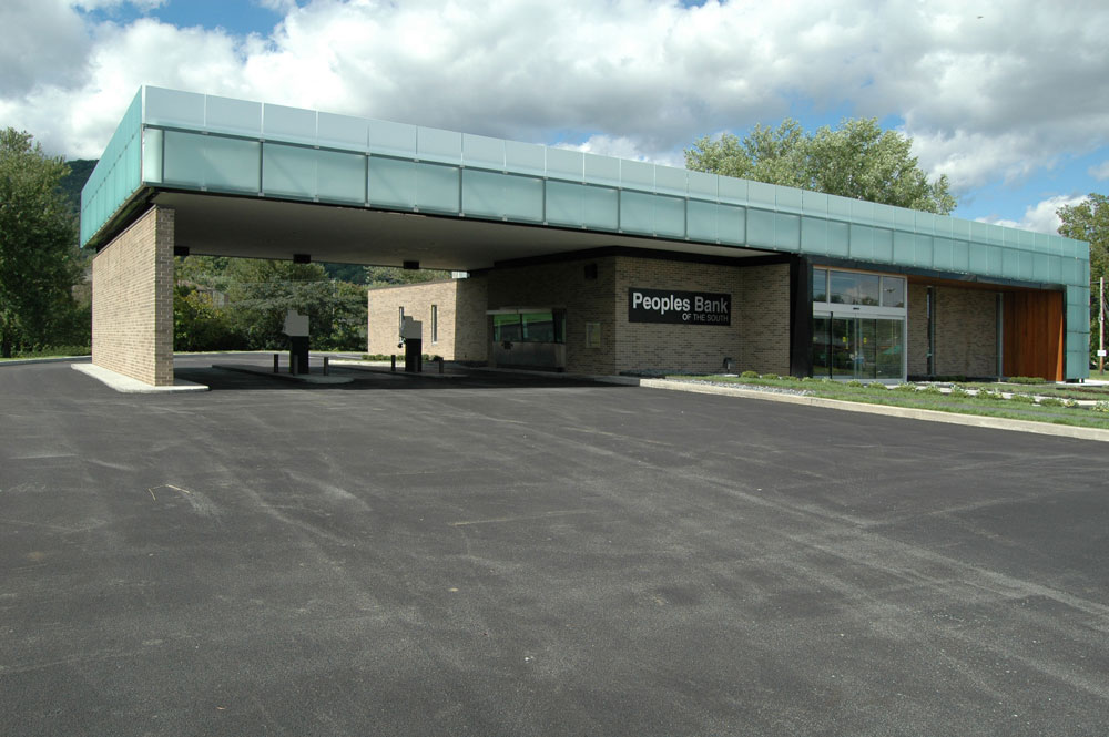
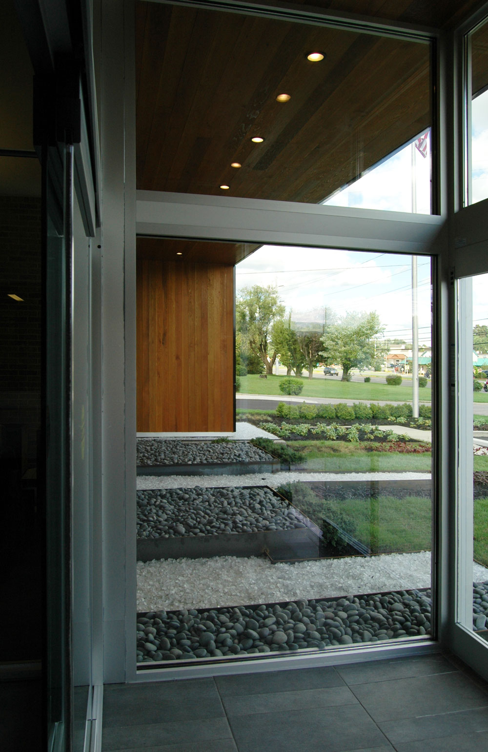
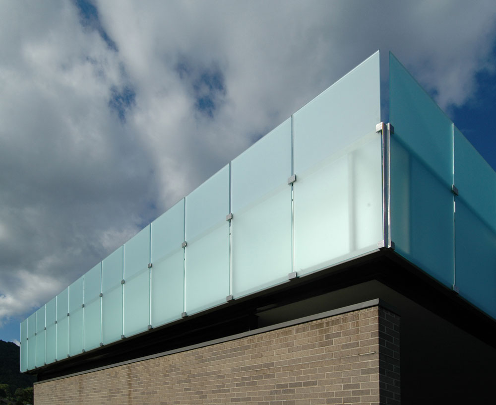
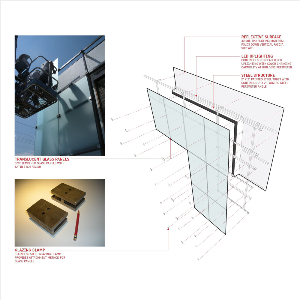
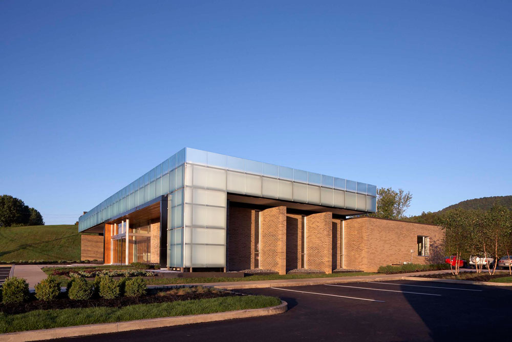
On the exterior, the owner’s request for added street presence along the busy highway was handled through the addition of a satin etched glass screen concealing LED uplighting with color changing capability. The subtle added height of these translucent panels gives the building new life while not sacrificing the well-conceived elegance and proportion of the existing modern forms. A stained smooth cedar tongue and groove wrap highlights a new frameless automatic door to a new entry airlock.
Client:
David Reynolds, President
Size:
4,400 SFCompletion Date:
Fall 2009Project Team:
Brandon F. Pace, AIA LEED AP – Principal in Charge
John L. Sanders, AIA LEED AP
Michael K. Aktalay, LEED AP
Michael A. Davis, LEED AP
Photo Credits:
Jeffrey Jacobs Photography (All diagrams courtesy of Sanders Pace Architecture)
Recognition:
AIA Tennessee Award of Merit [2010]
AIA East Tennessee Award of Honor [2009]
Bank Building
Hi-Design Publishing Hong Kong
March 2012